Strategy
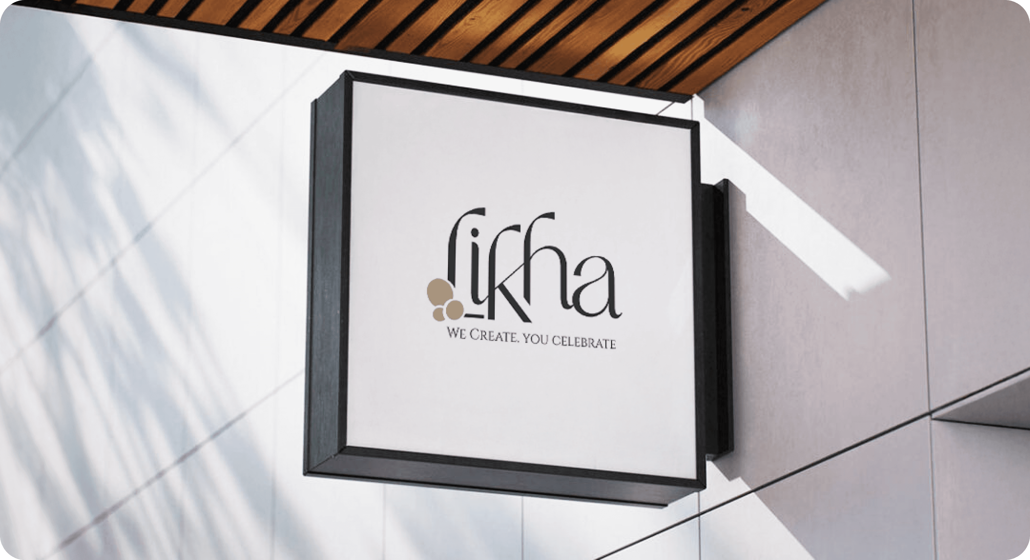
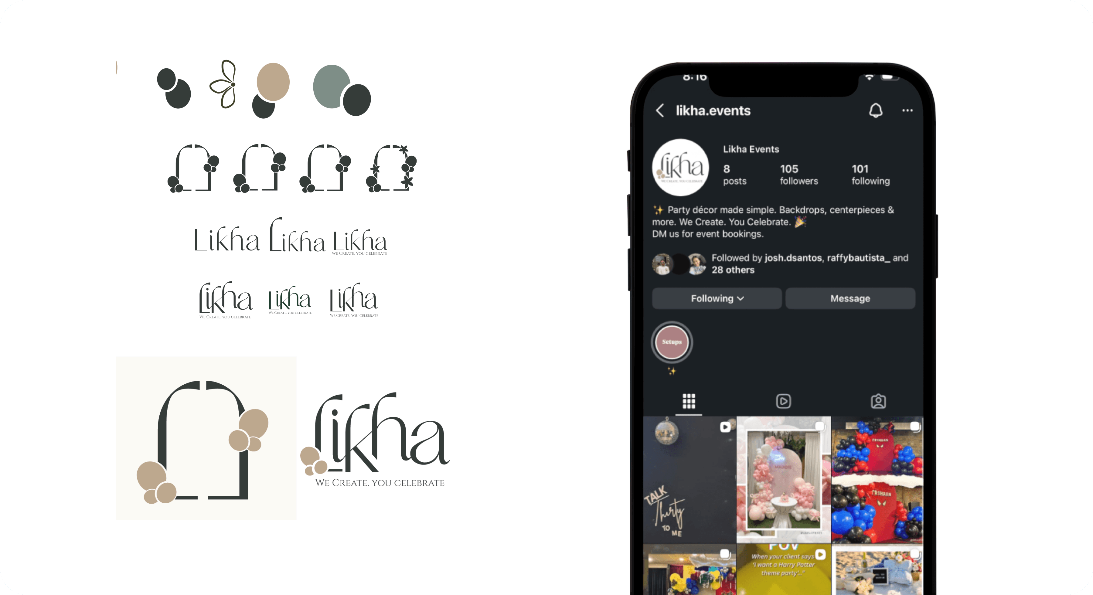
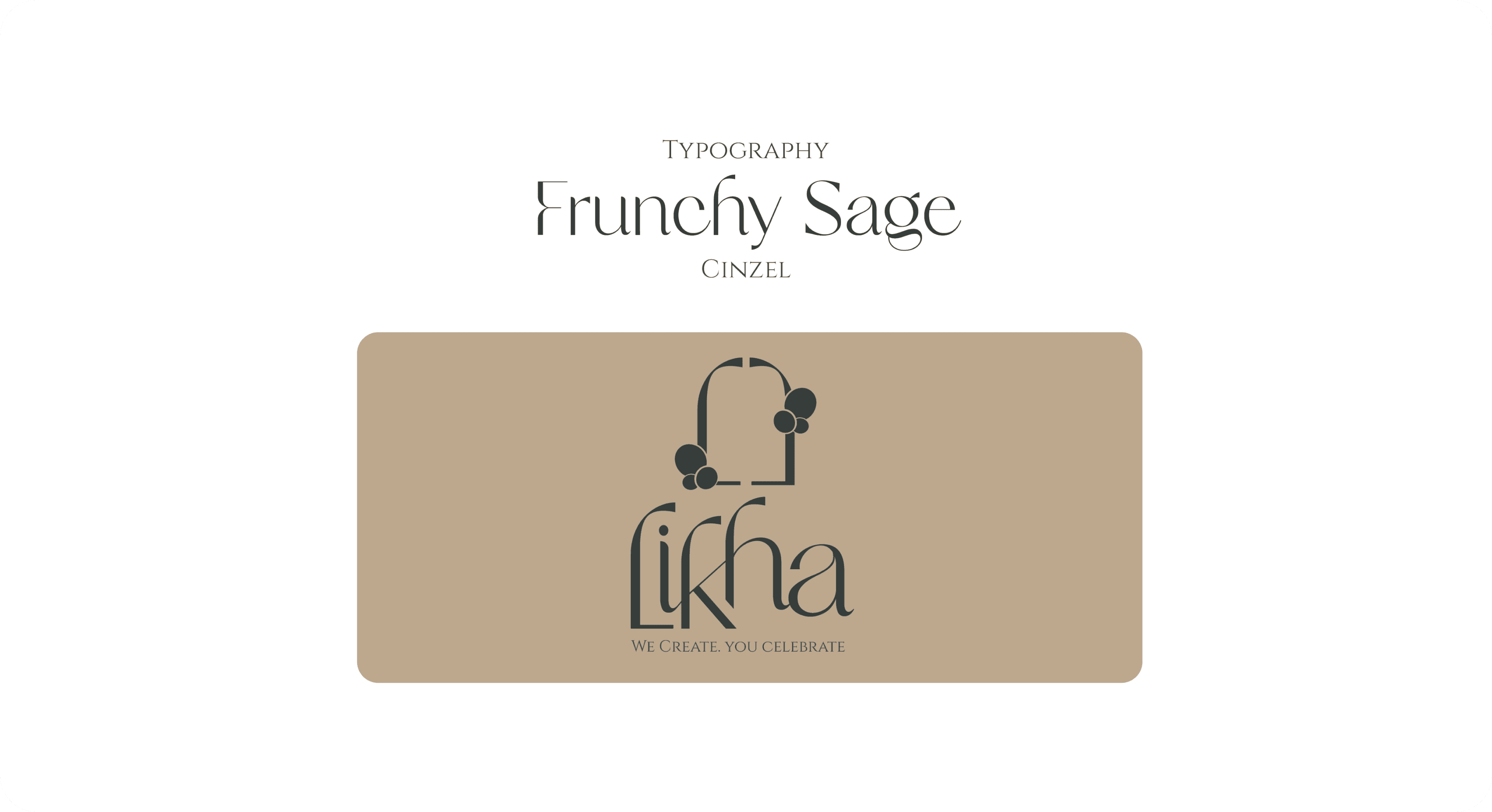
To work efficiently within the constraints, I focused on building a strong foundational system rather than overly decorative elements. I selected accessible, legible typefaces that conveyed softness and elegance while remaining practical for both print and digital use. The logo and wordmark were designed to be clean and adaptable, allowing them to sit comfortably across business cards, social media, and future marketing materials.
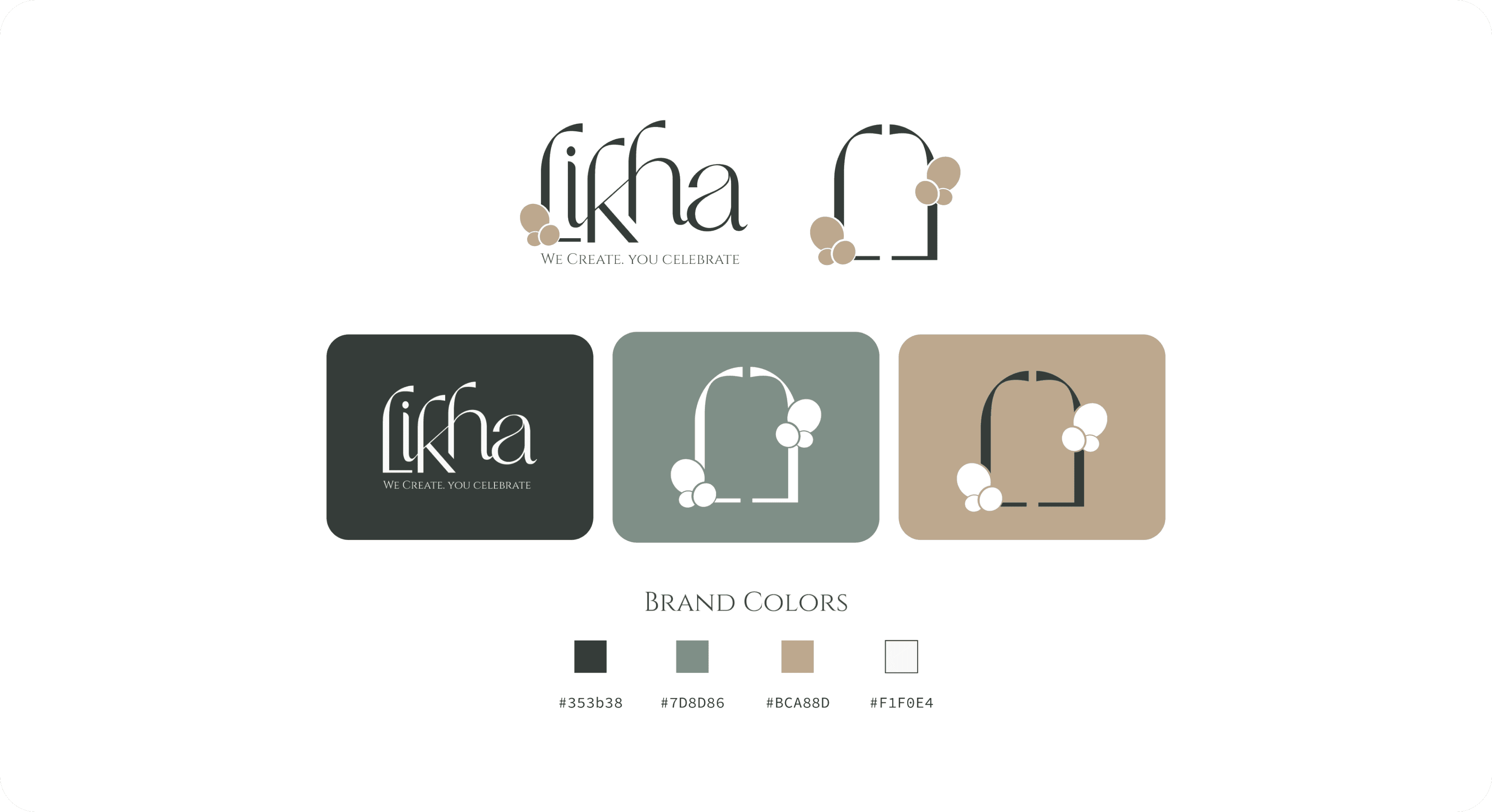
Visual decisions were informed by Likha Events’ core services—floral arrangements and balloon décor—through subtle curves, balanced spacing, and a refined yet friendly tone rather than literal illustrations. The brand guidelines were intentionally concise and clear, enabling the client to confidently apply the identity on their own moving forward.
Given the tight timeline, close collaboration and rapid iteration were key. Frequent check-ins helped align creative direction early, reducing revisions and ensuring efficient execution within four days.
Likha Logo Exploration
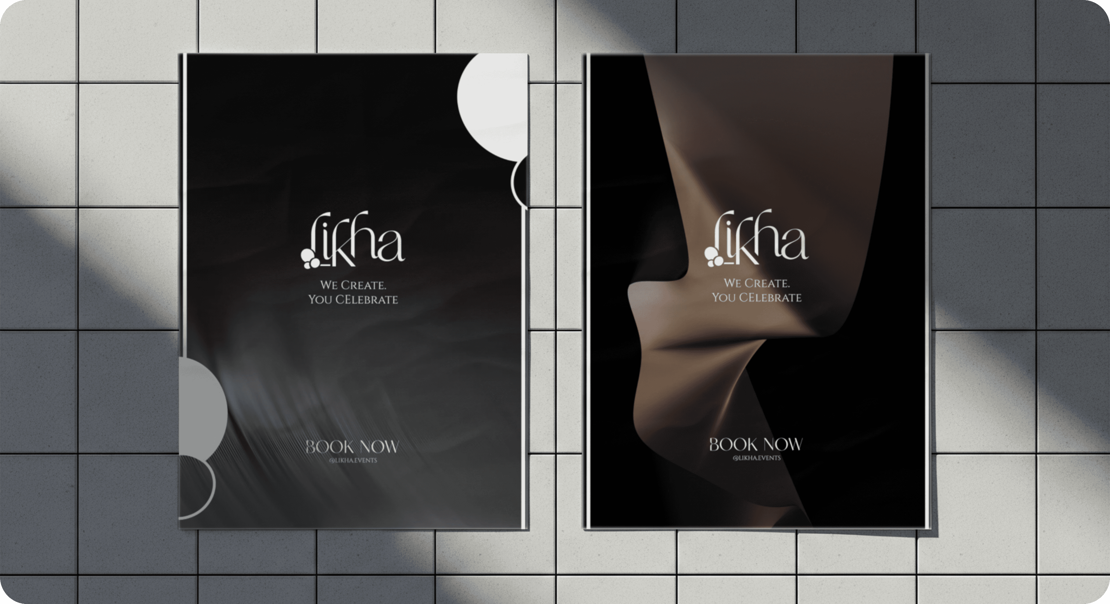
Likha Sample posters
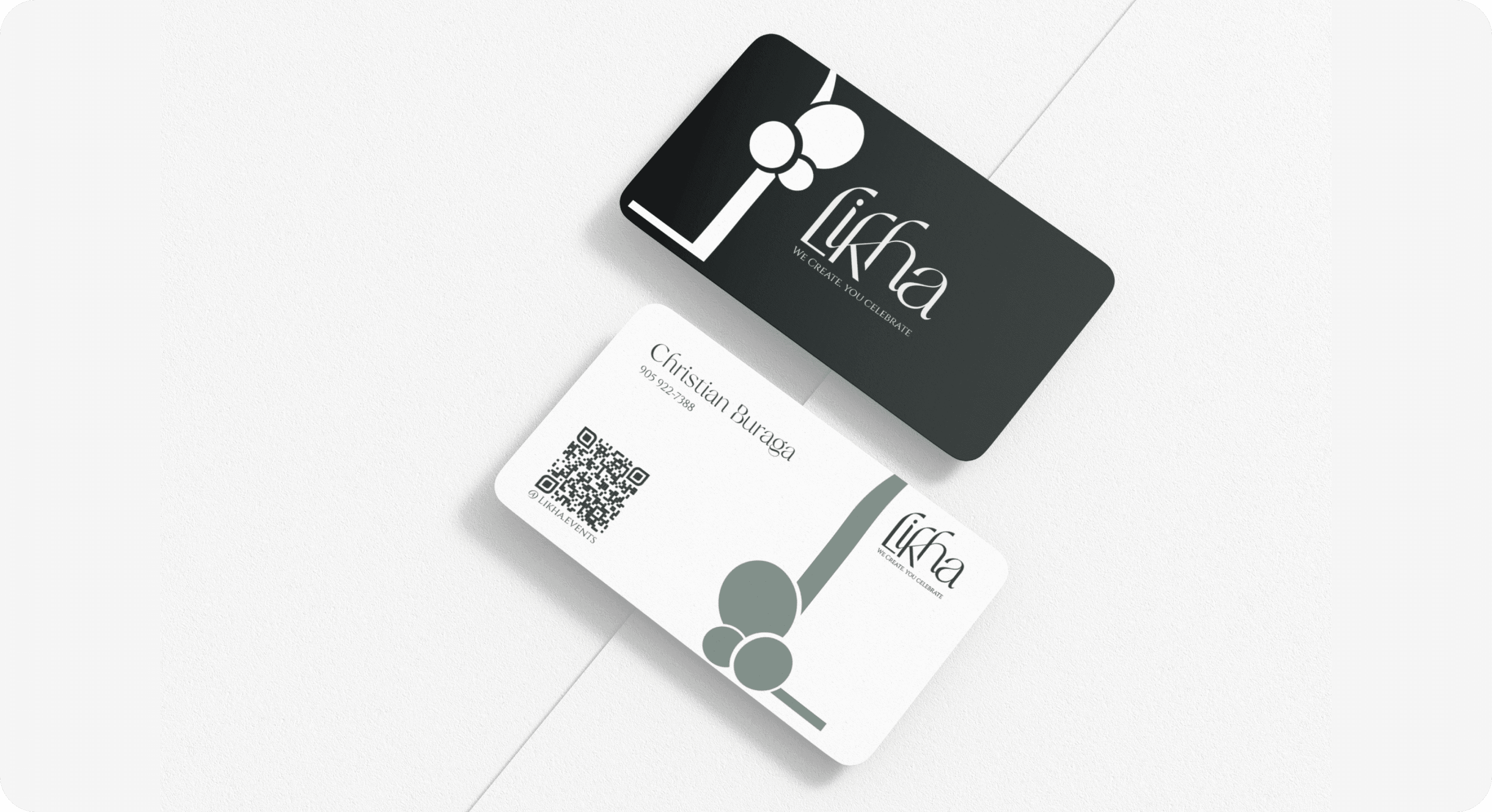
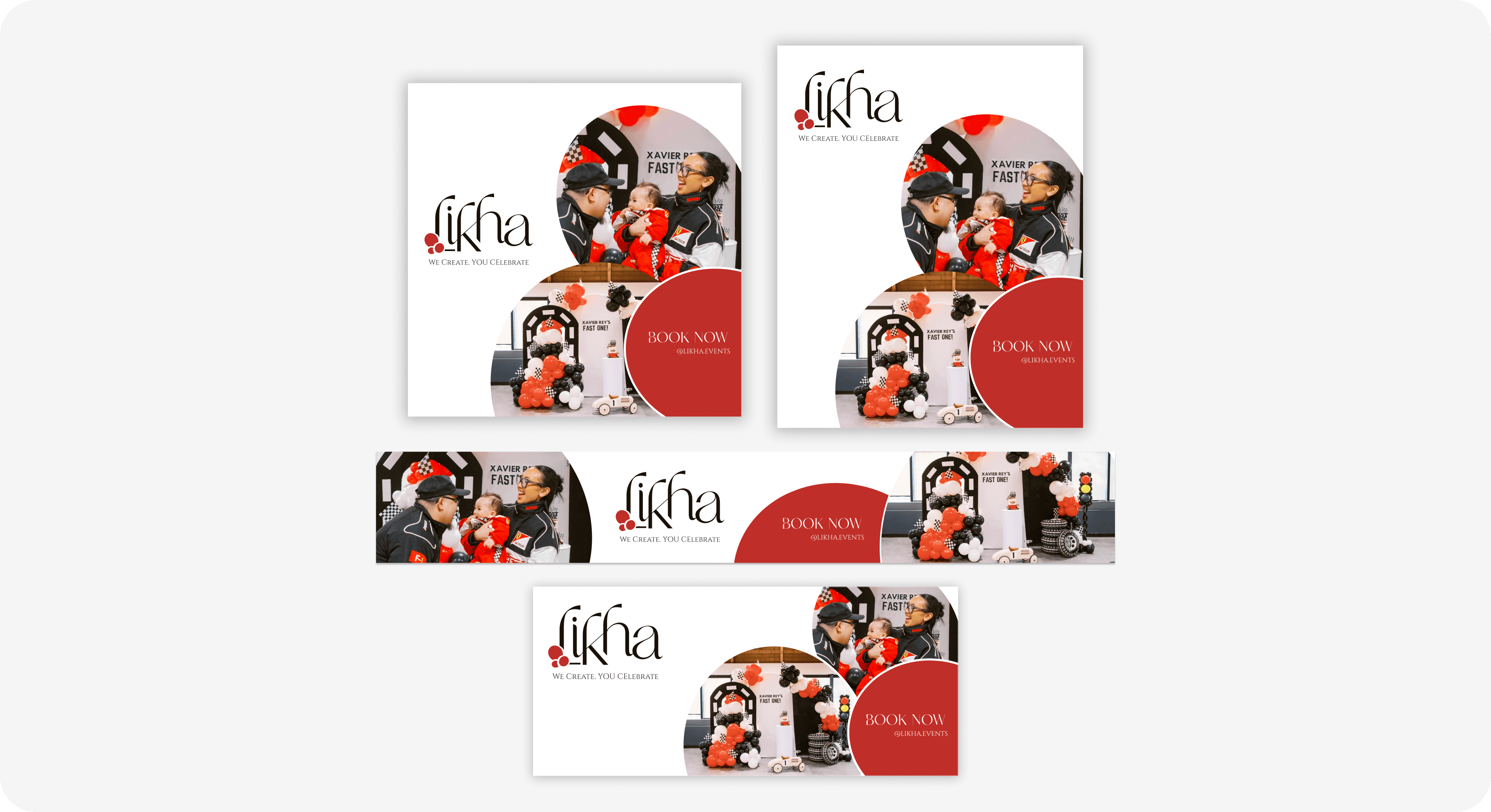
Likha Sample Ads
Given the tight timeline, close collaboration and rapid iteration were key. Frequent check-ins helped align creative direction early, reducing revisions and ensuring efficient execution within four days.
Key Takeaways
Strong brand foundations don’t require large budgets—clarity and consistency can be just as impactful
Tight timelines benefit from early alignment and decisive design choices
Designing scalable systems is especially important for small businesses in early stages
Collaboration and trust with the client can significantly speed up the creative process
Simple, well-considered design often communicates elegance more effectively than over-designed visuals
Strategy
To work efficiently within the constraints, I focused on building a strong foundational system rather than overly decorative elements. I selected accessible, legible typefaces that conveyed softness and elegance while remaining practical for both print and digital use. The logo and wordmark were designed to be clean and adaptable, allowing them to sit comfortably across business cards, social media, and future marketing materials.
Visual decisions were informed by Likha Events’ core services—floral arrangements and balloon décor—through subtle curves, balanced spacing, and a refined yet friendly tone rather than literal illustrations. The brand guidelines were intentionally concise and clear, enabling the client to confidently apply the identity on their own moving forward.
Given the tight timeline, close collaboration and rapid iteration were key. Frequent check-ins helped align creative direction early, reducing revisions and ensuring efficient execution within four days.
Likha Logo Exploration
Likha Sample posters
Likha Sample Ads
Given the tight timeline, close collaboration and rapid iteration were key. Frequent check-ins helped align creative direction early, reducing revisions and ensuring efficient execution within four days.
Key Takeaways
Strong brand foundations don’t require large budgets—clarity and consistency can be just as impactful
Tight timelines benefit from early alignment and decisive design choices
Designing scalable systems is especially important for small businesses in early stages
Collaboration and trust with the client can significantly speed up the creative process
Simple, well-considered design often communicates elegance more effectively than over-designed visuals